Code
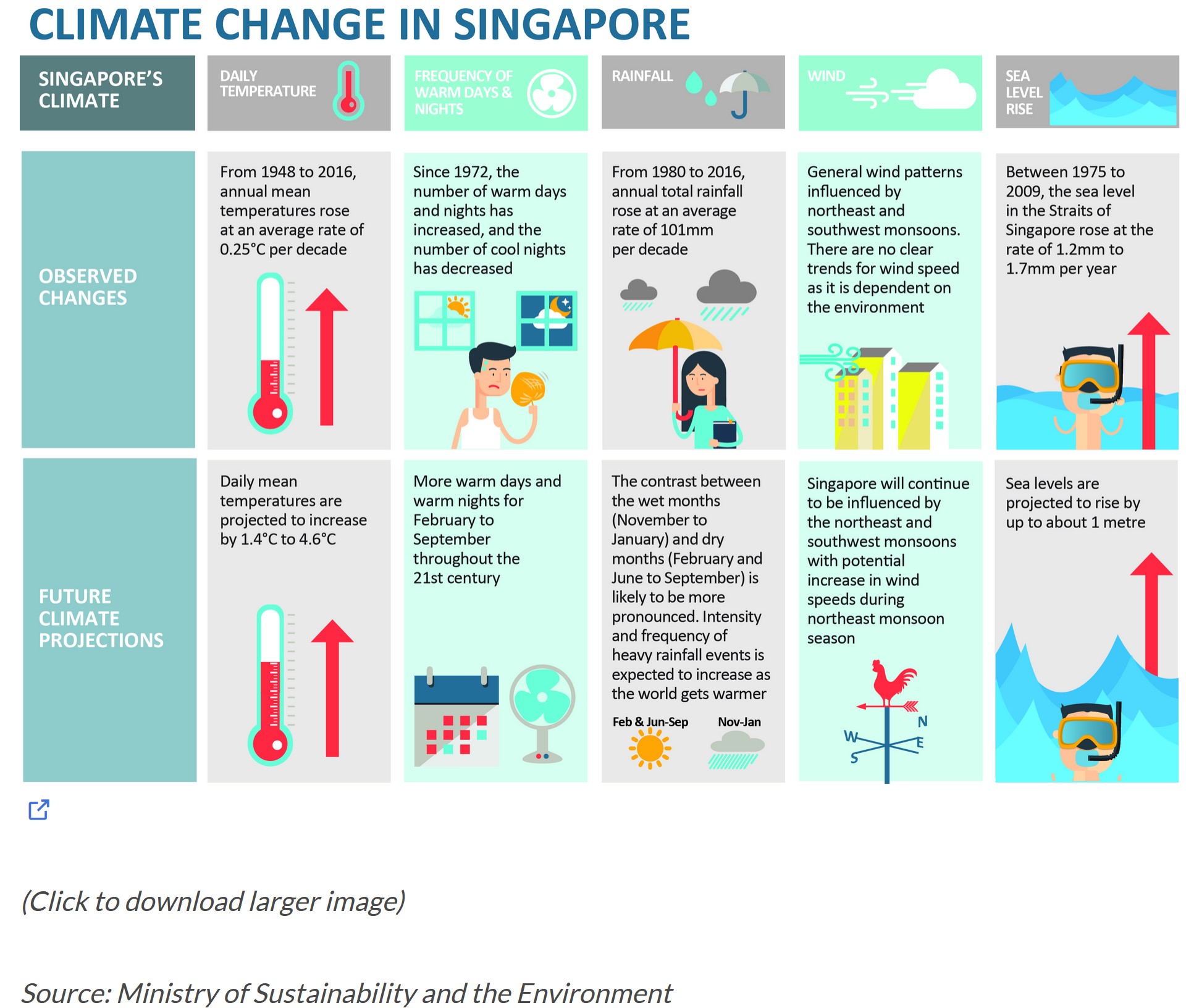
pacman::p_load("readr", "dplyr", "ggplot2", "plotly")According to an office report as shown in the infographic below,
Daily mean temperature are projected to increase by 1.4 to 4.6, and
The contrast between the wet months (November to January) and dry month (February and June to September) is likely to be more pronounced.
Select a weather station and download historical daily temperature or rainfall data from Meteorological Service Singapore website,
Select either daily temperature or rainfall records of a month of the year 1983, 1993, 2003, 2013 and 2023 and create an analytics-driven data visualisation,
Apply appropriate interactive techniques to enhance the user experience in data discovery and/or visual story-telling.
In this exercise, four R packages will be used. They are:
readr: Used for reading and importing CSV files. Functions like read_csv are part of the readr package.
dplyr: Used for data manipulation and analysis. Functions like bind_rows, select, group_by, and summarize are part of the dplyr package.
ggplot2: Used for creating static and dynamic (with ggplotly) plots and visualizations.
plotly: Used for creating interactive plots and visualizations. Functions like plot_ly and ggplotly are part of the plotly package.
pacman::p_load("readr", "dplyr", "ggplot2", "plotly")In this exercise, we will be working with the daily rainfall records for the month of August in the years 1983, 1993, 2003, 2013, and 2023 in the area of Changi. We will import the data for these five years using the "read.csv" function.
changi198308 <- read.csv("data/DAILYDATA_S24_198308.csv",fileEncoding = "ISO-8859-1")
changi199308 <- read.csv("data/DAILYDATA_S24_199308.csv", fileEncoding = "ISO-8859-1")
changi200308 <- read.csv("data/DAILYDATA_S24_200308.csv", fileEncoding = "ISO-8859-1")
changi201308 <- read.csv("data/DAILYDATA_S24_201308.csv", fileEncoding = "ISO-8859-1")
changi202308 <- read.csv("data/DAILYDATA_S24_202308.csv")colnames(changi198308) [1] "Station" "Year"
[3] "Month" "Day"
[5] "Daily.Rainfall.Total..mm." "Highest.30.Min.Rainfall..mm."
[7] "Highest.60.Min.Rainfall..mm." "Highest.120.Min.Rainfall..mm."
[9] "Mean.Temperature...C." "Maximum.Temperature...C."
[11] "Minimum.Temperature...C." "Mean.Wind.Speed..km.h."
[13] "Max.Wind.Speed..km.h." colnames(changi199308) [1] "Station" "Year"
[3] "Month" "Day"
[5] "Daily.Rainfall.Total..mm." "Highest.30.Min.Rainfall..mm."
[7] "Highest.60.Min.Rainfall..mm." "Highest.120.Min.Rainfall..mm."
[9] "Mean.Temperature...C." "Maximum.Temperature...C."
[11] "Minimum.Temperature...C." "Mean.Wind.Speed..km.h."
[13] "Max.Wind.Speed..km.h." colnames(changi200308) [1] "Station" "Year"
[3] "Month" "Day"
[5] "Daily.Rainfall.Total..mm." "Highest.30.Min.Rainfall..mm."
[7] "Highest.60.Min.Rainfall..mm." "Highest.120.Min.Rainfall..mm."
[9] "Mean.Temperature...C." "Maximum.Temperature...C."
[11] "Minimum.Temperature...C." "Mean.Wind.Speed..km.h."
[13] "Max.Wind.Speed..km.h." colnames(changi201308) [1] "Station" "Year"
[3] "Month" "Day"
[5] "Daily.Rainfall.Total..mm." "Highest.30.Min.Rainfall..mm."
[7] "Highest.60.Min.Rainfall..mm." "Highest.120.Min.Rainfall..mm."
[9] "Mean.Temperature...C." "Maximum.Temperature...C."
[11] "Minimum.Temperature...C." "Mean.Wind.Speed..km.h."
[13] "Max.Wind.Speed..km.h." colnames(changi202308) [1] "Station" "Year"
[3] "Month" "Day"
[5] "Daily.Rainfall.Total..mm." "Highest.30.min.Rainfall..mm."
[7] "Highest.60.min.Rainfall..mm." "Highest.120.min.Rainfall..mm."
[9] "Mean.Temperature...C." "Maximum.Temperature...C."
[11] "Minimum.Temperature...C." "Mean.Wind.Speed..km.h."
[13] "Max.Wind.Speed..km.h." By examining the variable names, we observe that the variable names are consistent across all tables. Consequently, we can merge the data from all five tables into a single unified dataset by using bind_rows.
changi <- bind_rows(changi198308, changi199308, changi200308, changi201308, changi202308)

summary(changi)
Station Year Month Day
Length:155 Min. :1983 Min. :8 Min. : 1
Class :character 1st Qu.:1993 1st Qu.:8 1st Qu.: 8
Mode :character Median :2003 Median :8 Median :16
Mean :2003 Mean :8 Mean :16
3rd Qu.:2013 3rd Qu.:8 3rd Qu.:24
Max. :2023 Max. :8 Max. :31
Daily.Rainfall.Total..mm. Highest.30.Min.Rainfall..mm.
Min. : 0.000 Length:155
1st Qu.: 0.000 Class :character
Median : 0.000 Mode :character
Mean : 5.434
3rd Qu.: 3.750
Max. :181.800
Highest.60.Min.Rainfall..mm. Highest.120.Min.Rainfall..mm.
Length:155 Length:155
Class :character Class :character
Mode :character Mode :character
Mean.Temperature...C. Maximum.Temperature...C. Minimum.Temperature...C.
Min. :25.50 Min. :27.80 Min. :21.60
1st Qu.:27.70 1st Qu.:31.10 1st Qu.:24.65
Median :28.50 Median :31.90 Median :25.80
Mean :28.29 Mean :31.66 Mean :25.56
3rd Qu.:28.95 3rd Qu.:32.40 3rd Qu.:26.70
Max. :30.10 Max. :33.90 Max. :28.20
Mean.Wind.Speed..km.h. Max.Wind.Speed..km.h. Highest.30.min.Rainfall..mm.
Min. : 2.90 Min. :23.0 Min. : 0.000
1st Qu.: 7.70 1st Qu.:31.6 1st Qu.: 0.000
Median :10.50 Median :36.0 Median : 0.000
Mean :10.34 Mean :37.0 Mean : 2.219
3rd Qu.:12.70 3rd Qu.:40.7 3rd Qu.: 2.400
Max. :18.10 Max. :75.6 Max. :16.400
NA's :124
Highest.60.min.Rainfall..mm. Highest.120.min.Rainfall..mm.
Min. : 0.000 Min. : 0.000
1st Qu.: 0.000 1st Qu.: 0.000
Median : 0.000 Median : 0.000
Mean : 2.458 Mean : 2.813
3rd Qu.: 3.200 3rd Qu.: 3.700
Max. :16.400 Max. :16.600
NA's :124 NA's :124 It is evident that numerous variables contain NA values. We will exclude the variables with NA values, and as this exercise focuses solely on the variation in rainfall, we will remove temperature-related variables. The remaining variables will be renamed appropriately.
names(changi) <- c("Station", "Year", "Month", "Day",
               "Daily Rainfall Total (mm)")

changi <- changi[ c("Year", "Month", "Day",
             "Daily Rainfall Total (mm)")]
We will merge the columns for year, month, and day into a new column with a date format. Retain the original year, month, and day columns for future filtering purposes.
changi$Date <- as.Date(paste(changi$Year, changi$Month, changi$Day, sep = "-"))We create an interactive bar chart using the plot_ly function, with daily rainfall totals plotted against the day of the month across the years of 1983, 1993, 2003, 2013, and 2023.
p2 <- changi %>%
  plot_ly(x = ~Day,
          y = ~`Daily Rainfall Total (mm)`,
          frame = ~Year,
          type = 'bar',
          hoverinfo = ~ 'y',
          marker = list(color = "#3459e6")) %>%
  layout(showlegend = FALSE)

p2The chart provides a dynamic and interactive way to explore how daily rainfall varies across different days of the month, with a focus on comparing this variation across multiple years. The animation allows for a temporal understanding of rainfall patterns.
X-axis (Day): The days of the month are plotted along the x-axis, indicating the progression of time within each month.
Y-axis (Daily Rainfall Total (mm)): The y-axis represents the daily rainfall totals in millimeters. Each bar’s height corresponds to the amount of rainfall recorded on a specific day.
Color and Animation (Year): The bars are color-coded, and the chart is animated based on the “Year” variable. Each frame of the animation corresponds to a different year, allowing you to observe how daily rainfall patterns change across multiple years.
Hover Information (hoverinfo = ~ 'y'): When you hover over a specific bar, the information displayed includes the y-value, which is the corresponding daily rainfall total for that day.
We generate a heatmap using the plot_ly function from the plotly package. This heatmap visualizes the daily rainfall records for the Changi area in the month of August across the years of 1983, 1993, 2003, 2013, and 2023.
p3 <- plot_ly(changi, x = ~Year, y = ~Day, z = ~`Daily Rainfall Total (mm)`, type = "heatmap", colorscale = "Viridis") %>%
  layout(title = "Rainfall Heatmap in August (1983-2023)",
         xaxis = list(title = "Year"),
         yaxis = list(title = "Day"))


p3The heatmap offers a comprehensive view of how daily rainfall patterns vary across the month of August for each year from 1983 to 2023. It allows for easy identification of trends, such as specific days or years with higher or lower rainfall.
X-axis (Year): The x-axis represents the years of 1983, 1993, 2003, 2013, and 2023. Each column in the heatmap corresponds to a specific year.
Y-axis (Day): The y-axis represents the days of the month (August). Each row in the heatmap corresponds to a specific day.
Z-axis (Daily Rainfall Total (mm)): The color intensity at each intersection of the year and day represents the daily rainfall total in millimeters. Darker colors indicate higher rainfall, while lighter colors indicate lower rainfall.
We generate a an interactive boxplot using the ggplot2 and plotly packages. The boxplot visualizes the distribution of daily rainfall totals in August for the years of 1983, 1993, 2003, 2013, and 2023 in the Changi area.
changi$Year <- as.factor(changi$Year)


color_palette <- c("#3459e6", "#e63491", "skyblue", "#fccb41", "#9c52d9")

# Create the ggplot with custom colors
p1 <- ggplot(changi, aes(x = Year, y = `Daily Rainfall Total (mm)`, fill = Year)) +
  geom_boxplot() +
  labs(title = "Boxplot of Daily Rainfall Total in August (1983-2023)",
       x = "Year",
       y = "Daily Rainfall Total (mm)"
  ) +
  scale_fill_manual(values = setNames(color_palette, levels(changi$Year))) +
  theme_minimal()

interactive_plot1 <- ggplotly(p1)

# Display the interactive plot
interactive_plot1The interactive boxplot allows users to compare the distribution of daily rainfall totals across different years in August. It provides insights into the variability and central tendencies of rainfall patterns over the specified time frame.
X-axis (Year): The x-axis represents the years from 1983, 1993, 2003, 2013, and 2023. Each boxplot is associated with a specific year, allowing for the comparison of rainfall distributions across years.
Y-axis (Daily Rainfall Total (mm)): The y-axis represents the daily rainfall totals in millimeters. The boxplots display the distribution of these values, including the median, quartiles, and potential outliers.
Boxplots (geom_boxplot()): Each boxplot provides a summary of the distribution of daily rainfall for a specific year. The box itself represents the interquartile range (IQR), with the median indicated by a line inside the box. Whiskers extend to the minimum and maximum values within a certain range, and potential outliers may be displayed as individual points.
Interactive Plot (ggplotly(p1)): The ggplotly function from the plotly package is used to convert the static ggplot object (p1) into an interactive plot, allowing for exploration and interaction with the data.
Custom Colors (scale_color_manual): The color palette is specified using thecolor_palette` vector for better distinction between years.
We generate an interactive line plot using the ggplot2 and plotly packages to visualize the daily rainfall totals in the Changi area over days for the years 1983, 1993, 2003, 2013, and 2023.
color_palette <- c("#3459e6", "#e63491", "skyblue", "#fccb41", "#9c52d9")
p4 <- ggplot() +
  geom_line(data = changi,
            aes(x = Day,
                y = `Daily Rainfall Total (mm)`,
                group = Year,
                color = Year),
            size = 1) +
  scale_color_manual(values = setNames(color_palette, levels(changi$Year)))+
  facet_grid(~Year) +
  labs(axis.text.x = element_blank(),
       title = "Changi Daily Rainfall Total Over Days by Year") +
  xlab("Day") +
  ylab("Daily Rainfall Total (mm)") +
  theme_minimal() +
  theme(
    panel.background = element_rect(fill = "white"),
    panel.grid.major = element_line(color = "lightgray"),
    panel.grid.minor = element_blank(),
    axis.line = element_line(color = "darkgrey"),
    legend.position = "none",
    plot.title = element_text(hjust = 0.5))

interactive_plot2 <- ggplotly(p4)

interactive_plot2The interactive line plot allows user to visually explore the daily variation in rainfall totals for each day of August across different years in the Changi area. It facilitates the comparison of rainfall trends over time, offering insights into potential patterns or anomalies.
X-axis (Day): The x-axis represents the days of the month (August).
Y-axis (Daily Rainfall Total (mm)): The y-axis represents the daily rainfall totals in millimeters.
Lines (geom_line()): Multiple lines are drawn, each corresponding to a specific year. The lines connect the daily rainfall totals for each day, providing a visual representation of the trend in rainfall over the month.
Color (color = Year): Each line is colored based on the corresponding year, allowing for easy differentiation of data series.
Faceting (`facet_grid(~Year)’): The plot is faceted by year, meaning that each year has its own subplot. This arrangement enables a direct comparison of rainfall patterns between different years.
Theme Configuration (theme): Various theme elements are adjusted for aesthetics and clarity, including background color, grid lines, axis lines, and title alignment.
Interactive Plot (ggplotly(p4)): The ggplotly function from the plotly package is used to convert the static ggplot object (p4) into an interactive plot, allowing for exploration and interaction with the data.
Custom Colors (scale_color_manual): The color palette is specified using thecolor_palette` vector for better distinction between years.
We calculate the annual average precipitation in the Changi area and then generate an interactive bar chart using the ggplot2 and plotly packages.
average_precipitation <- changi %>%
  group_by(Year) %>%
  summarize(AvgPrecipitation = mean(`Daily Rainfall Total (mm)`, na.rm = TRUE))

p5 <- ggplot(average_precipitation, aes(x = Year, y = AvgPrecipitation , fill = Year)) +
  geom_col() +
  labs(title = "Average Daily Rainfall Total by Year",
       x = "Year",
       y = "Average Daily Rainfall Total (mm)") +
  scale_fill_manual(values = setNames(color_palette, levels(changi$Year))) +
  theme_minimal()

# Convert ggplot to plotly
interactive_plot3 <- ggplotly(p5)

# Show the interactive plot
interactive_plot3This interactive bar chart illustrates the annual variations in average rainfall in the Changi area. Users can interactively explore and compare the average daily rainfall totals across different years.
Compute Averages: Using the group_by and summarize functions, the changi data is grouped by year, and the average daily rainfall total for each year is calculated, creating a new data frame named average_precipitation.
X-axis (Year): The x-axis represents different years.
Y-axis (AvgPrecipitation): The y-axis represents the annual average rainfall in millimeters.
Bar Chart (geom_col()): Each year is represented by a bar, where the height of the bar corresponds to the average rainfall for that year.
Color (fill = Year): Each bar is colored based on the corresponding year, facilitating the differentiation of data for different years.
Interactive Plot (ggplotly(p5)): The ggplotly function is used to convert the static ggplot object (p5) into an interactive plot, allowing users to explore and interact with the data.
Custom Colors (scale_color_manual): The color palette is specified using thecolor_palette` vector for better distinction between years.
combined_plot <- subplot(
  interactive_plot1,
  subplot(
    interactive_plot2,
    interactive_plot3,
    nrows = 2,
    shareX = TRUE
  ),
  nrows = 1,
  titleX = TRUE  # Set this to TRUE to show titles along the X-axis
)

# Display the combined plot with a common title
combined_plot <- combined_plot %>% layout(title = "Interactive Rainfall Data Visualization")

# Show the combined plot
combined_plotThe combined plot provides an interactive overview of rainfall data, allowing users to explore the distribution, patterns, and averages of daily rainfall across different years. The use of subplots facilitates a comprehensive visual exploration of the data from multiple perspectives.
In the Changi region, the median daily rainfall for the month of August remained consistently at 0 in 1983, 1993, 2003, 2013, and 2023. This pattern is attributed to August being the dry season in Singapore. Notably, the year 1983 exhibited the highest average rainfall among the five years. However, the distribution of daily rainfall values for this year 1983 is relatively concentrated, with the exception of an outlier on August 22nd, where the total rainfall exceeded 180mm. In contrast, both 2013 and 2023 did not experience any outliers with daily rainfall surpassing 50mm. The year 1993, on the other hand, recorded the lowest average rainfall, accompanied by the smallest interquartile range.